Web & mobile platform
DigitAll by Allianz
The daily operating app for 5,000+ Allianz agencies — performance, customers, policies and announcements on web and mobile, taken from zero to launch.
- 5,000+Allianz agencies the app servesAllianz Türkiye, 2025 annual report
- 630+Screens & states designedWeb 221 · Mobile 412
- 4.7App Store ratingApp Store Türkiye
The problem
Allianz Türkiye’s agencies ran their day across reports, portals and phone calls — renewals, auto-cancellations, targets and campaign news all lived in different places. Some agents are power users, others rarely touch digital tools; both needed one place that tells them what to act on today.
To replace their spreadsheets, the app had to be trusted at a glance: the same numbers, rules and states on every screen.
My role
I joined Allianz mid-project and stayed through launch — two years designing DigitAll’s web platform and mobile app side by side with the Wunder team.
- Responsive dashboards · web & mobile
- Data visualisation & charts
- Figma component library & states
- Strategy sessions & stakeholder reviews
Constraints
How Igot there
- 01
Align
Joined mid-way: audited existing flows, Allianz brand guidelines and open decisions to get up to speed fast.
- 02
Prioritise
Ranked every metric by what agents act on daily — renewals, cancellations, targets — and built the hierarchy around it.
- 03
Design
Started with Notifications, then dashboards and charts, designing web and mobile in parallel; validated in frequent reviews.
- 04
Systemise
Documented every state and edge case with arrowed notes, so 430+ screens reached developers without guesswork.
Flow 01 · Home
The home screen,in context
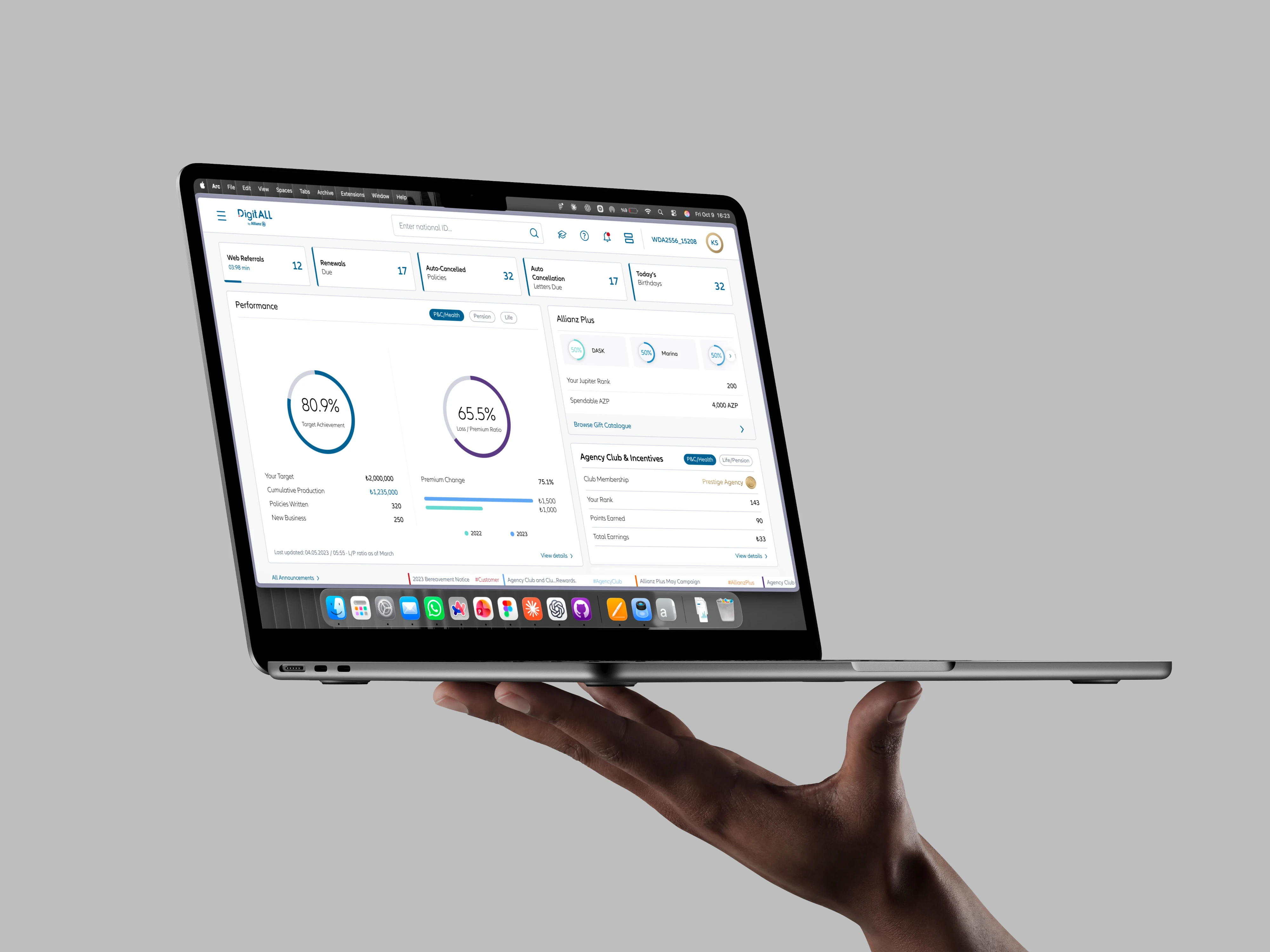
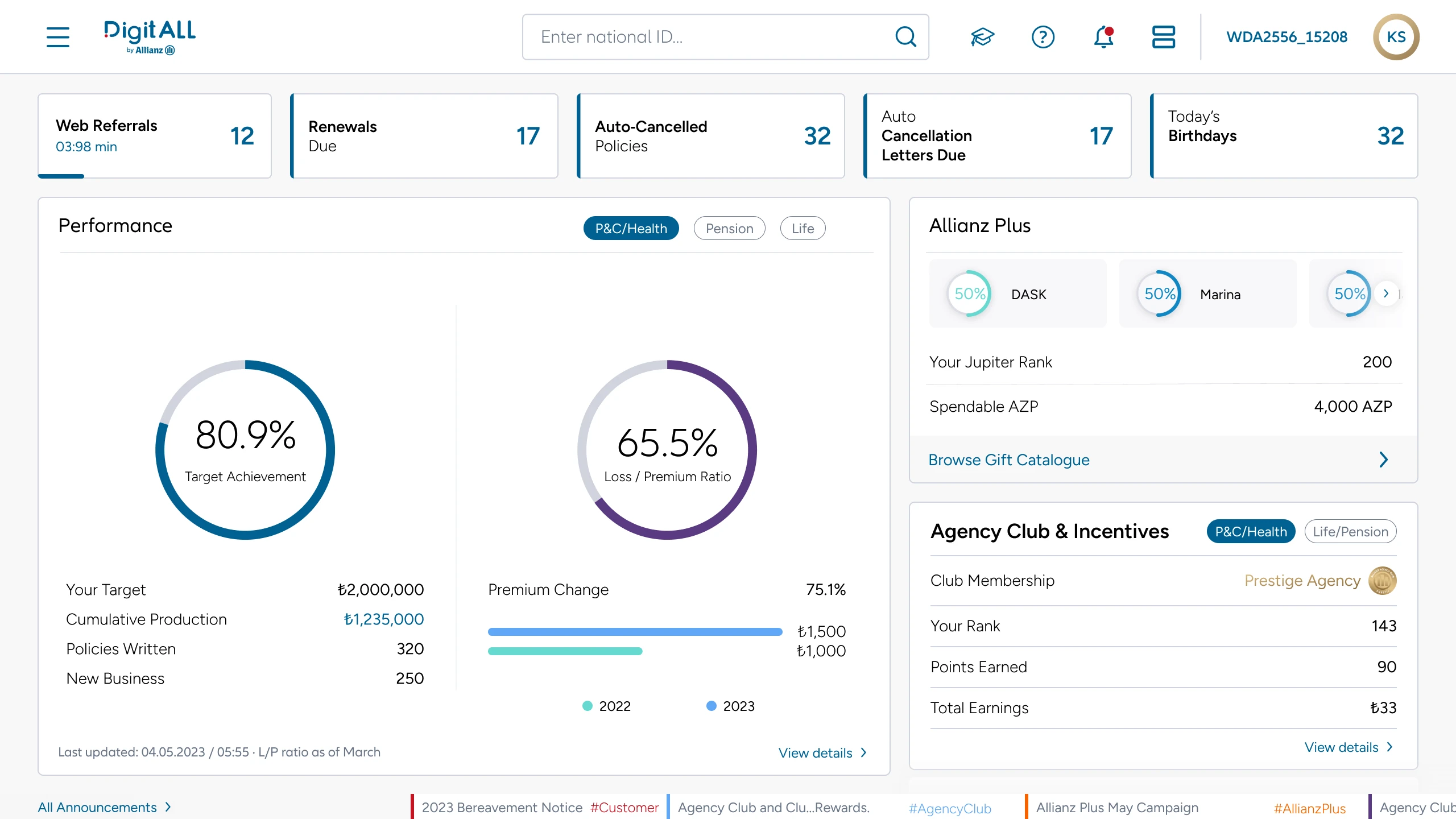
Agents open DigitAll first thing in the morning. The home screen had to answer one question — what needs me today? — for every agency type, club tier and product line, on a desk or on a phone.
- 01
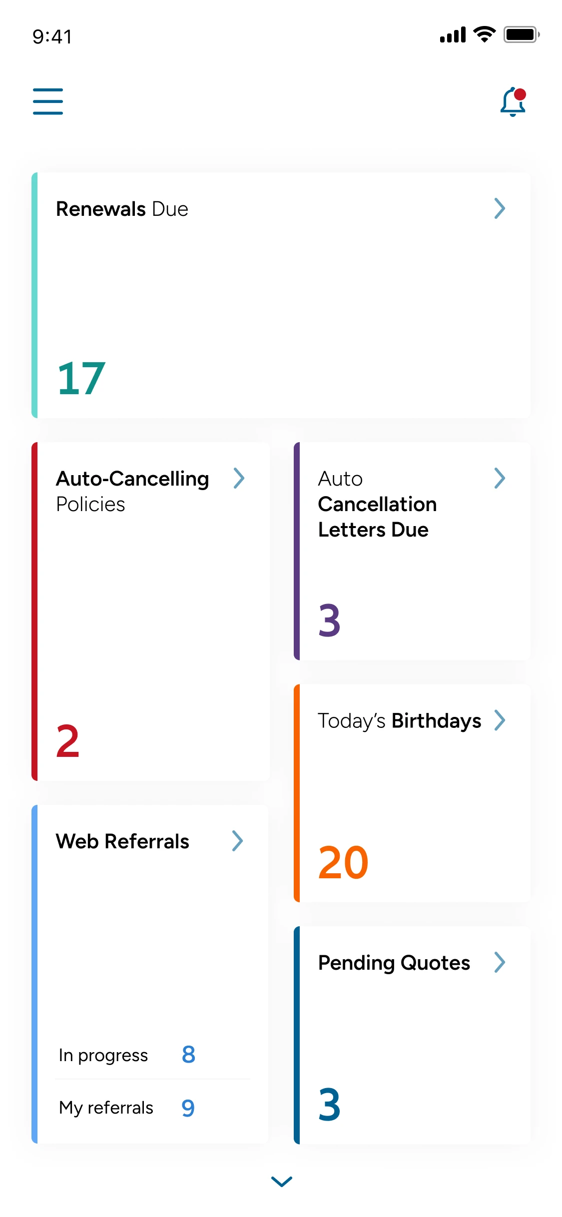
Priorities, not panels
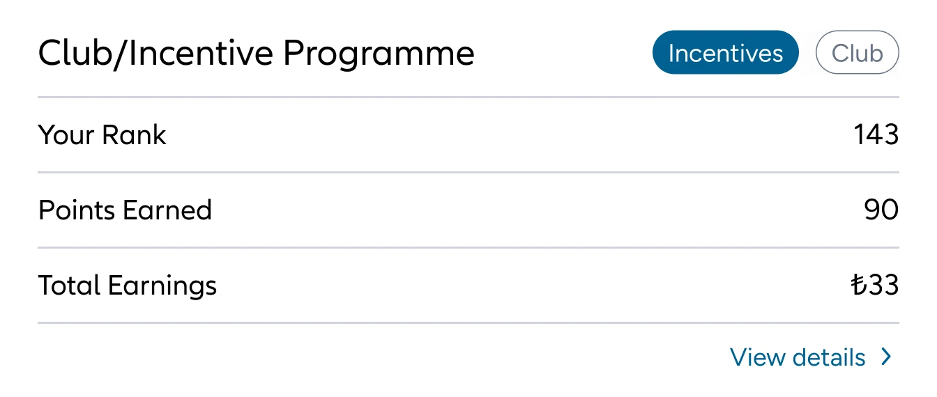
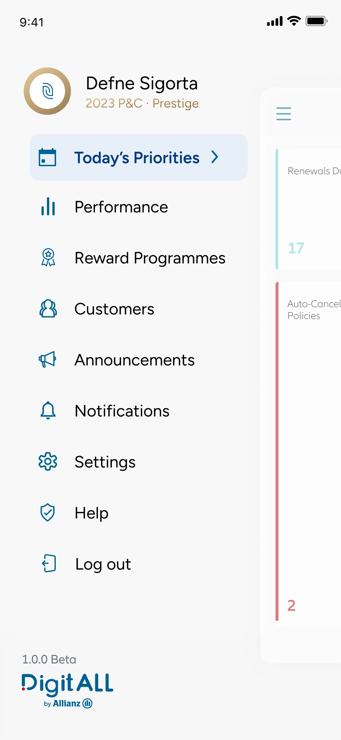
Web shows performance, Allianz Plus and club status side by side; mobile turns them into one prioritised card stack.
- 02
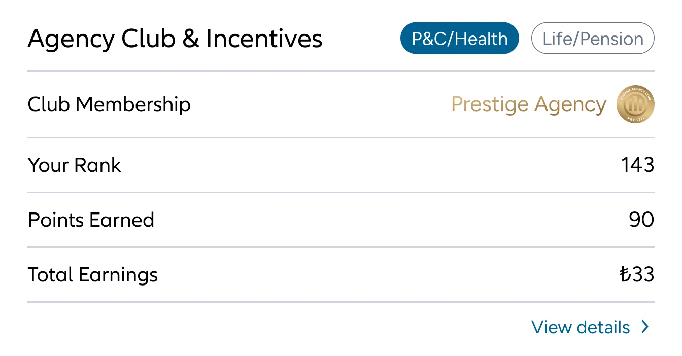
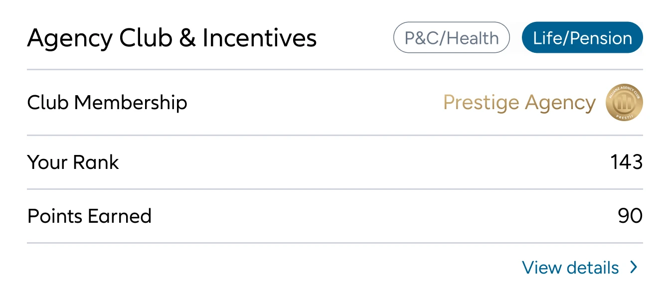
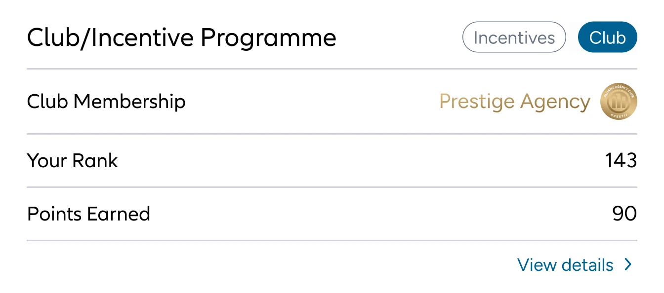
One card, ten agency types
The club card adapts to agency type, permissions and tier without changing the layout around it.
- 03
Layouts that flex
The grid works with five or six priorities, so no agency ever sees an empty slot.
Flow 02 · Performance
Every number,in its place
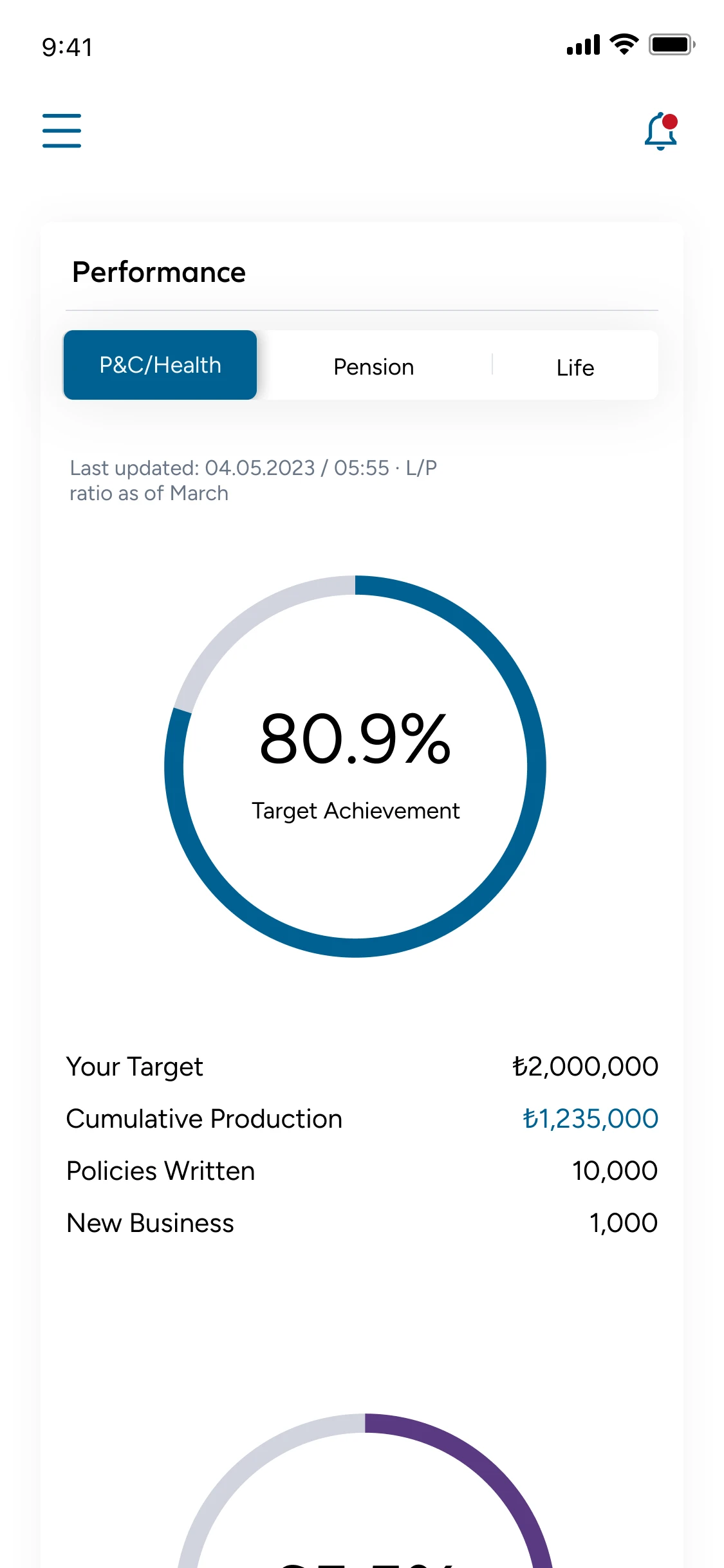
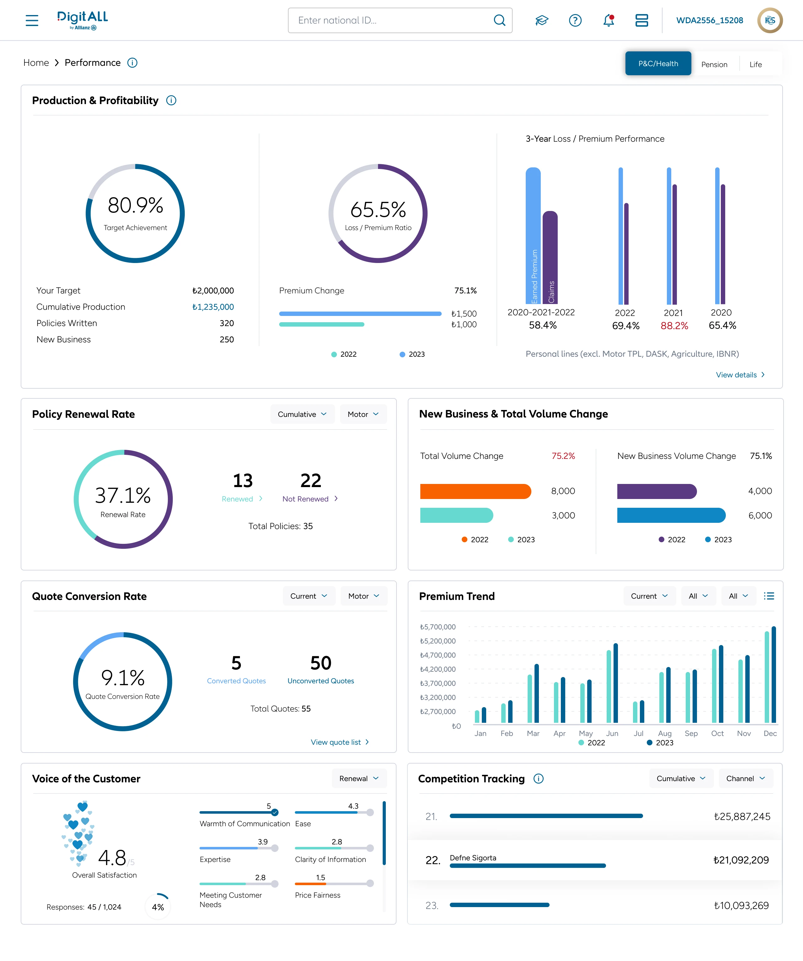
Production, loss ratio, renewals, competition, customer voice — agents needed all of it, and needed it to match. The same numbers, colours and states carry from the web grid to every mobile view.
- 01
One chart at a time
An eight-widget grid on web becomes one focused chart per view on mobile, with filters in a bottom sheet.
- 02
Progress, not just numbers
Tier progress shows the distance to the next goal and which criteria are open — even at zero.
- 03
Every chart has a next step
Renewal rate opens the unrenewed policies, with a one-click action to follow up.
Flow 03 · Announcements
A noisy feed,made calm
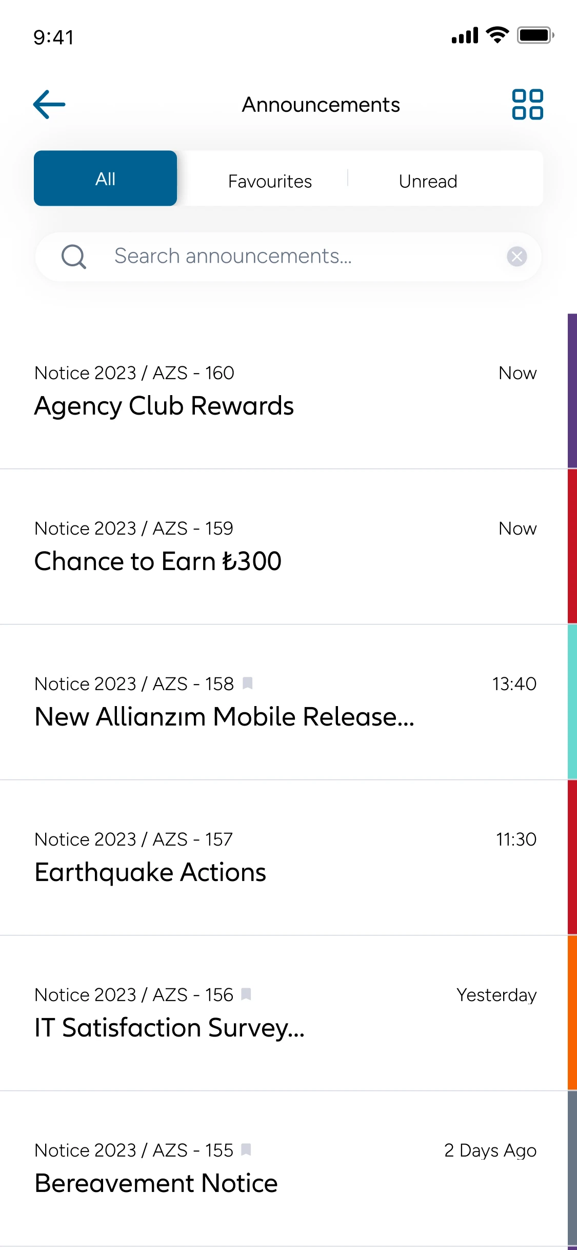
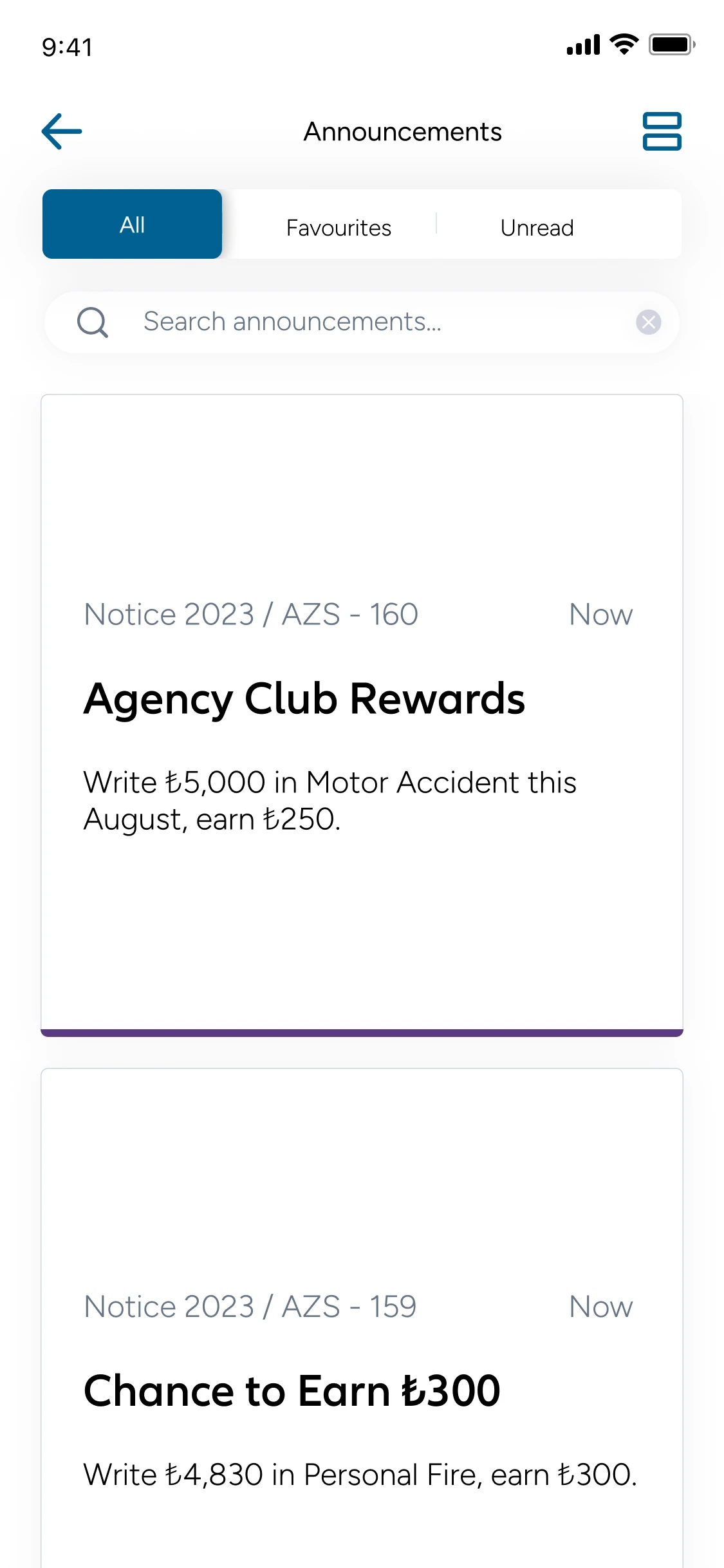
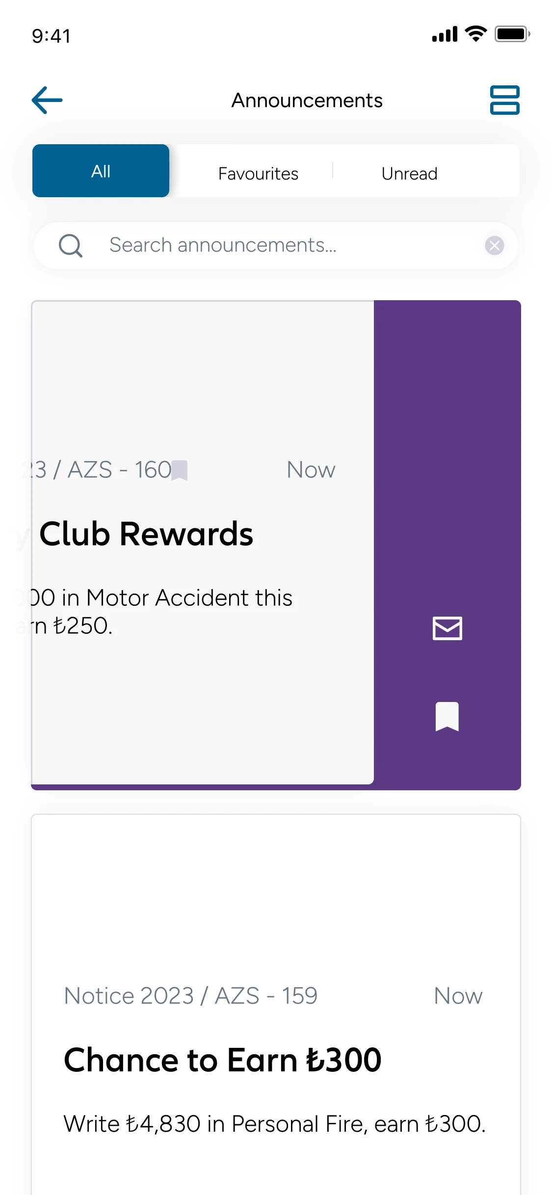
Campaigns, incentives and news land every week. Agents needed to find what matters, keep track of what they’ve read and save what they’ll need later — my first flow on the project.

- 01
Three ways to read
Table, list and card views share one model: dense on the desk, scannable on the go.
- 02
Every state, designed
Read, unread and favourite combine into four states that read at a glance; empty states are never blank.
- 03
Swipe to triage
Mark as read or save to favourites straight from the list, without opening each item.
Handoff
Every state,delivered
Screens went to developers as annotated Figma files, through Dev Mode, Jira tickets and joint reviews with the Wunder team — every state, edge case and interaction marked with arrows and notes.
From the build · Premium Trend
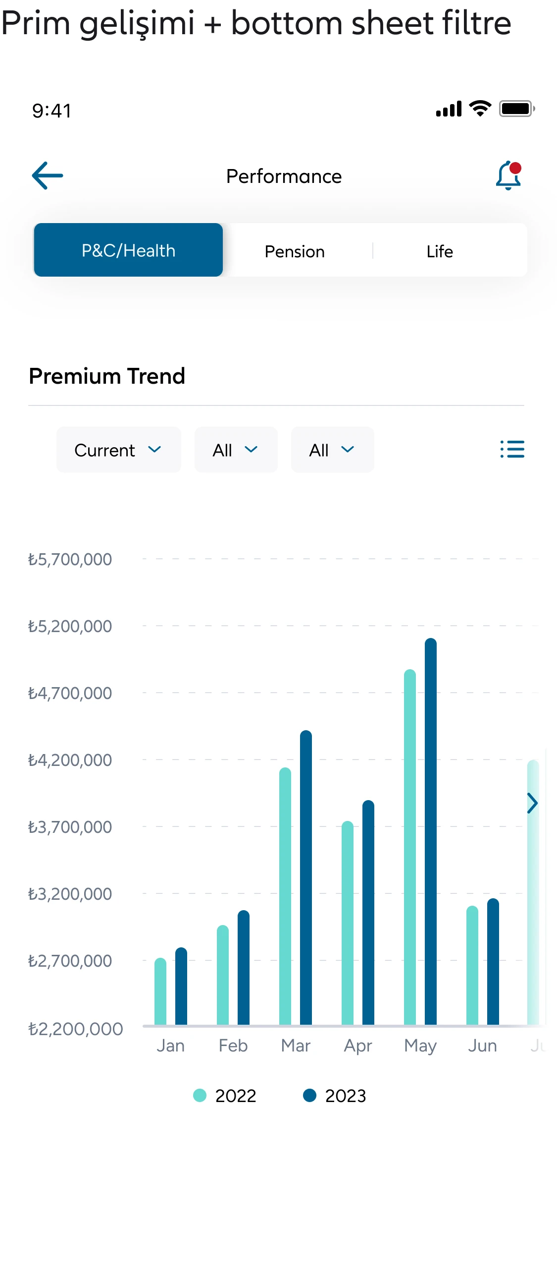
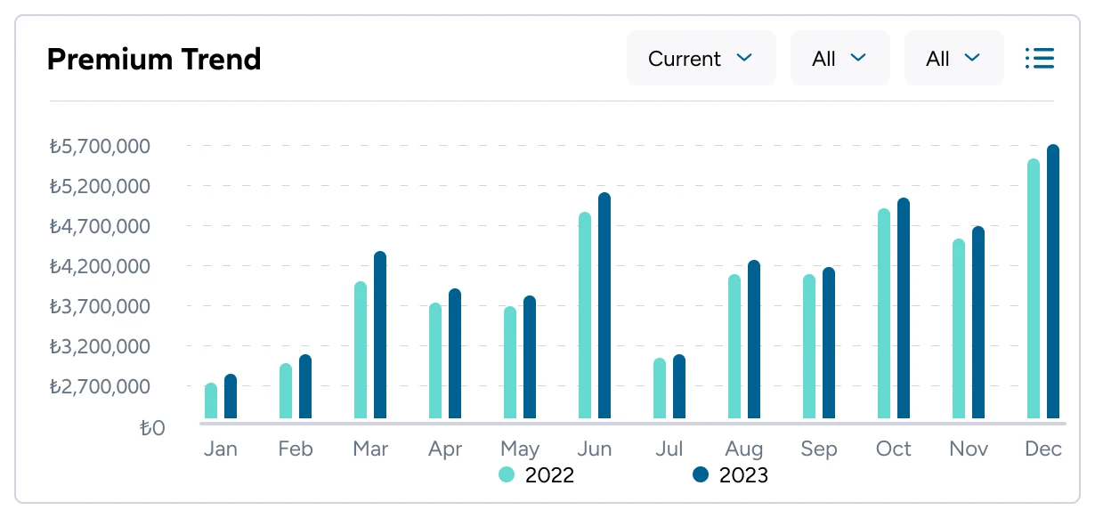
Twelve months of paired bars didn’t fit a phone screen — squeezed, they were unreadable. I proposed a swipeable chart: bars stay full size and agents swipe through the year.
- 01
Every state, delivered
Read, unread, favourite, empty and edge-case states shipped with each screen — nothing left for developers to guess.
- 02
Notes with arrows
Arrows and notes on every screen explained swipes, bottom sheets and what happens next.
- 03
Reviewed together
Dev Mode, Jira tickets and reviews with Wunder kept design and build in step.
Outcome
WhatI learned
- 01
Design for the phone first
The Premium Trend chart taught me to test dense data on the smallest screen early — what’s readable on a 375px phone shapes the whole layout.
- 02
Handoff is part of the design
Arrows, states and edge cases weren’t extras; they were how the design survived the build. The clearer the notes, the fewer questions came back.
- 03
Joining mid-project
Coming in halfway, I learned to audit and listen before redesigning — keeping what already worked made the new flows land faster.