Branding & website
EK Hukuk & Danışmanlık
Identity, UI kit and website for a new law firm in Denizli, Türkiye — from the first sketch of the monogram to the live site.
- Sep 2025Firm founded — the identity started with itDenizli, Türkiye
- 8UI kit chaptersTokens, icons, forms, page blocks, legal
- 6Page templates designedHome, About, Practice areas, detail, Cookies, 404
The brief
Attorney in law Emre Küçük founded EK Hukuk & Danışmanlık in Denizli in September 2025, advising companies and individuals.
A new firm had to feel established from day one: an identity, a brand book and a website that explain law in plain Turkish — calm, clear and trustworthy.
My role
I designed it end to end — brand book, UI kit and every page of the website — and saw it through to the live site.
- Brand book & logo system
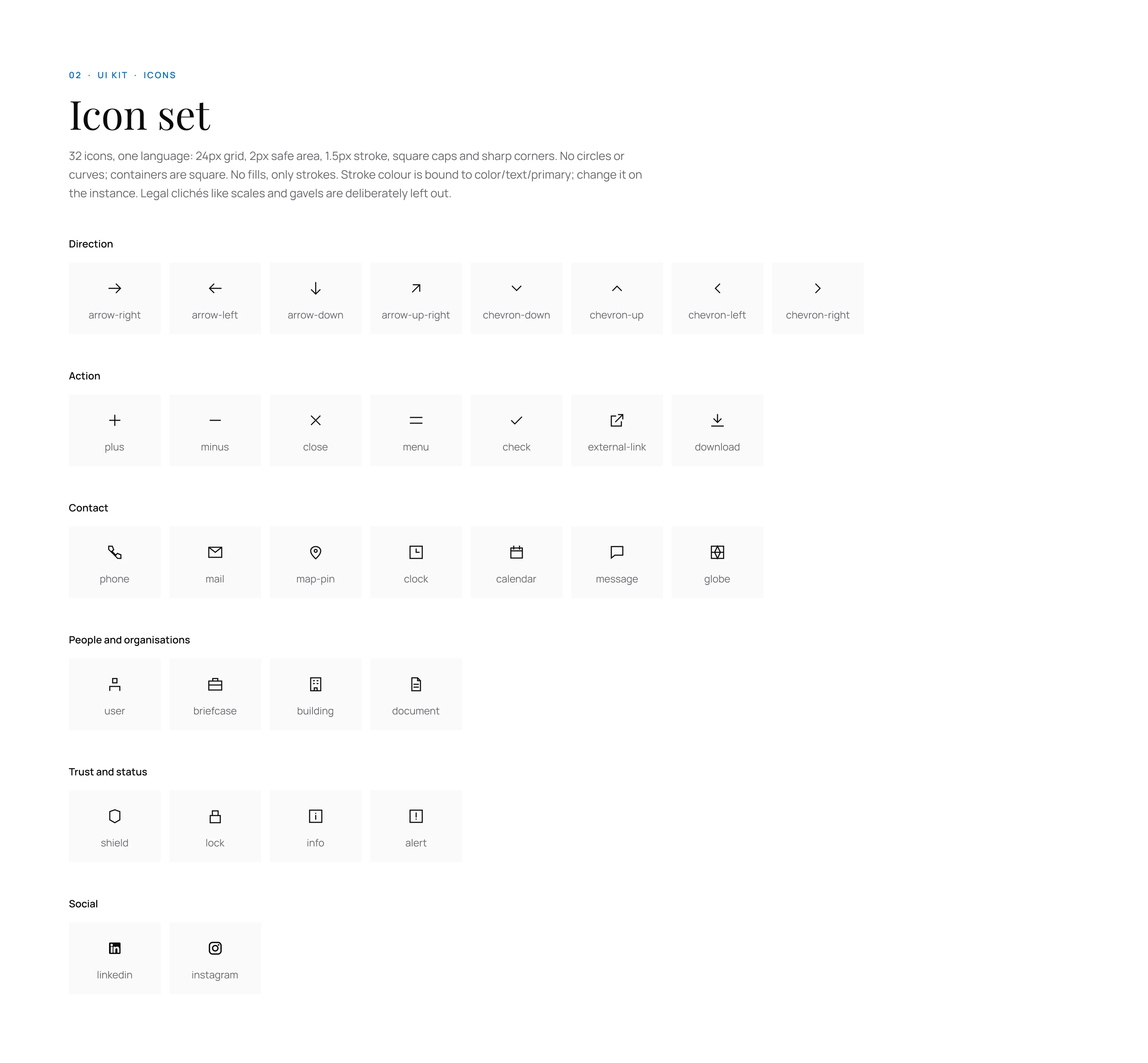
- UI kit · tokens, 32 icons, components
- Website · 6 page templates
- Tone of voice & legal pages
The challenge
How Igot there
- 01
Listen
Started from how the firm wanted to sound: formal, but not distant — and from what the bar rules don’t allow.
- 02
Identity
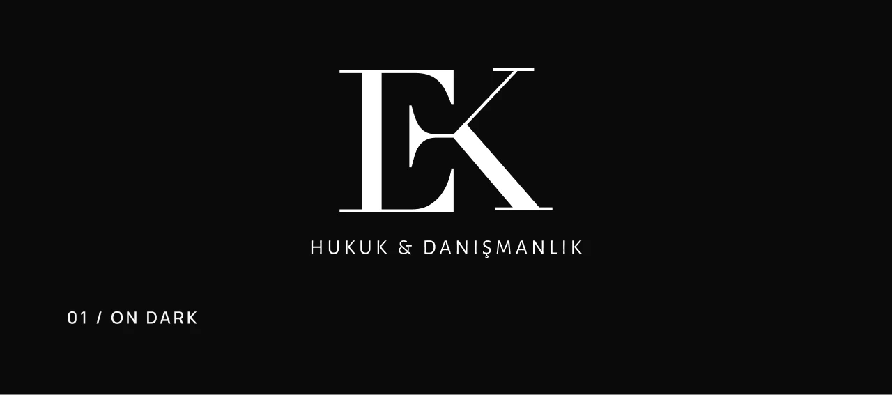
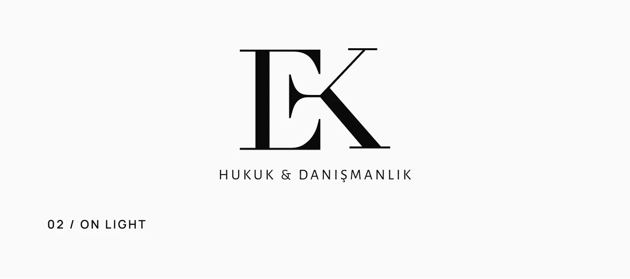
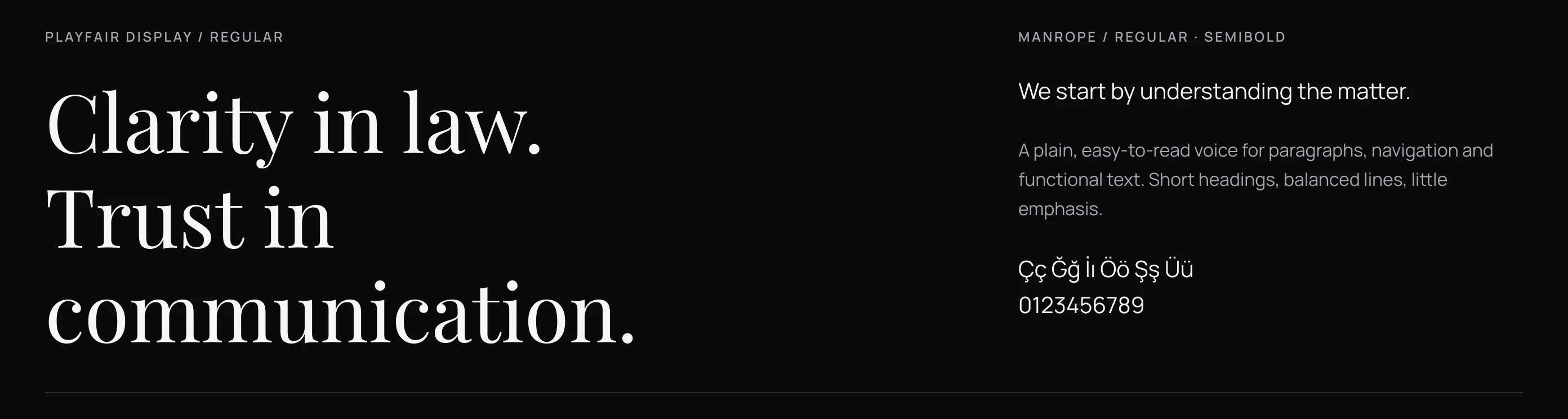
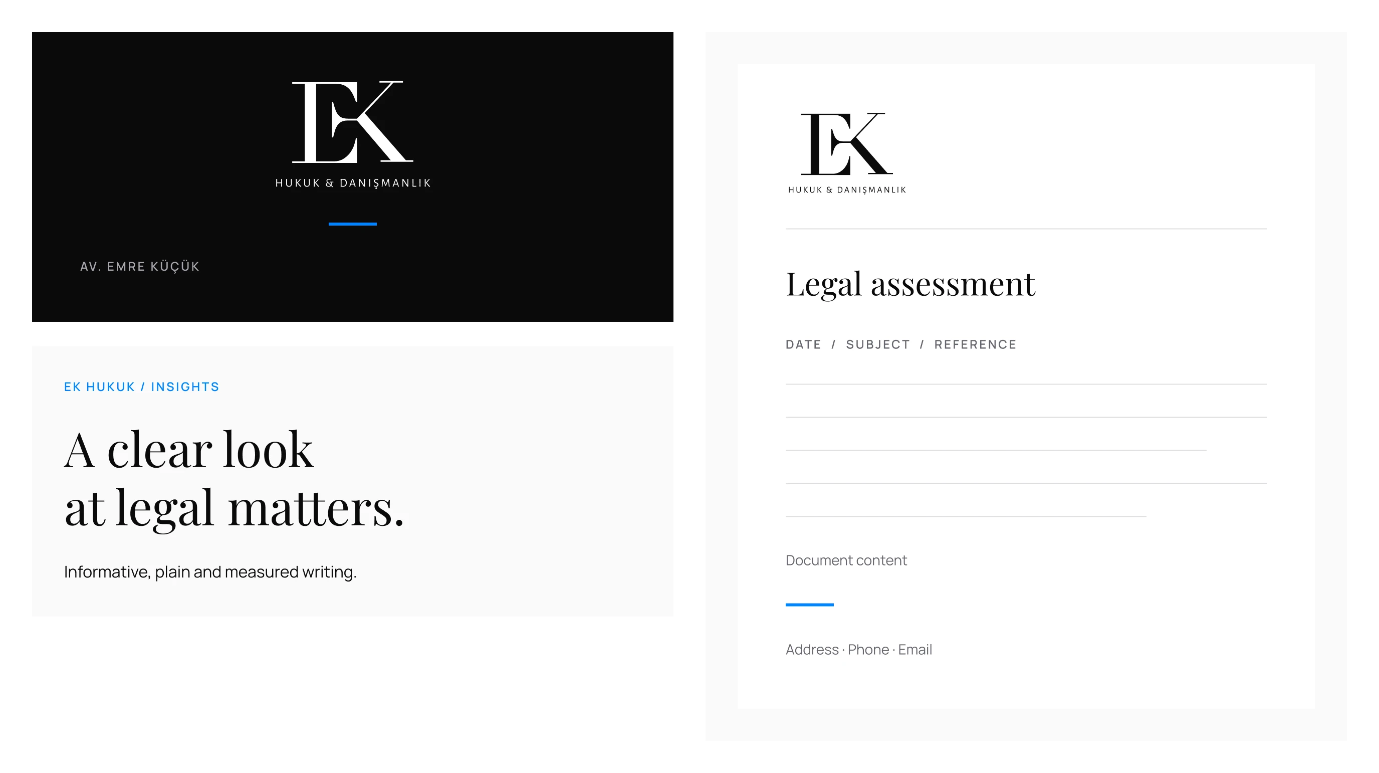
Designed the EK monogram, then set Playfair Display with Manrope and a black-and-white palette with a touch of azure.
- 03
System
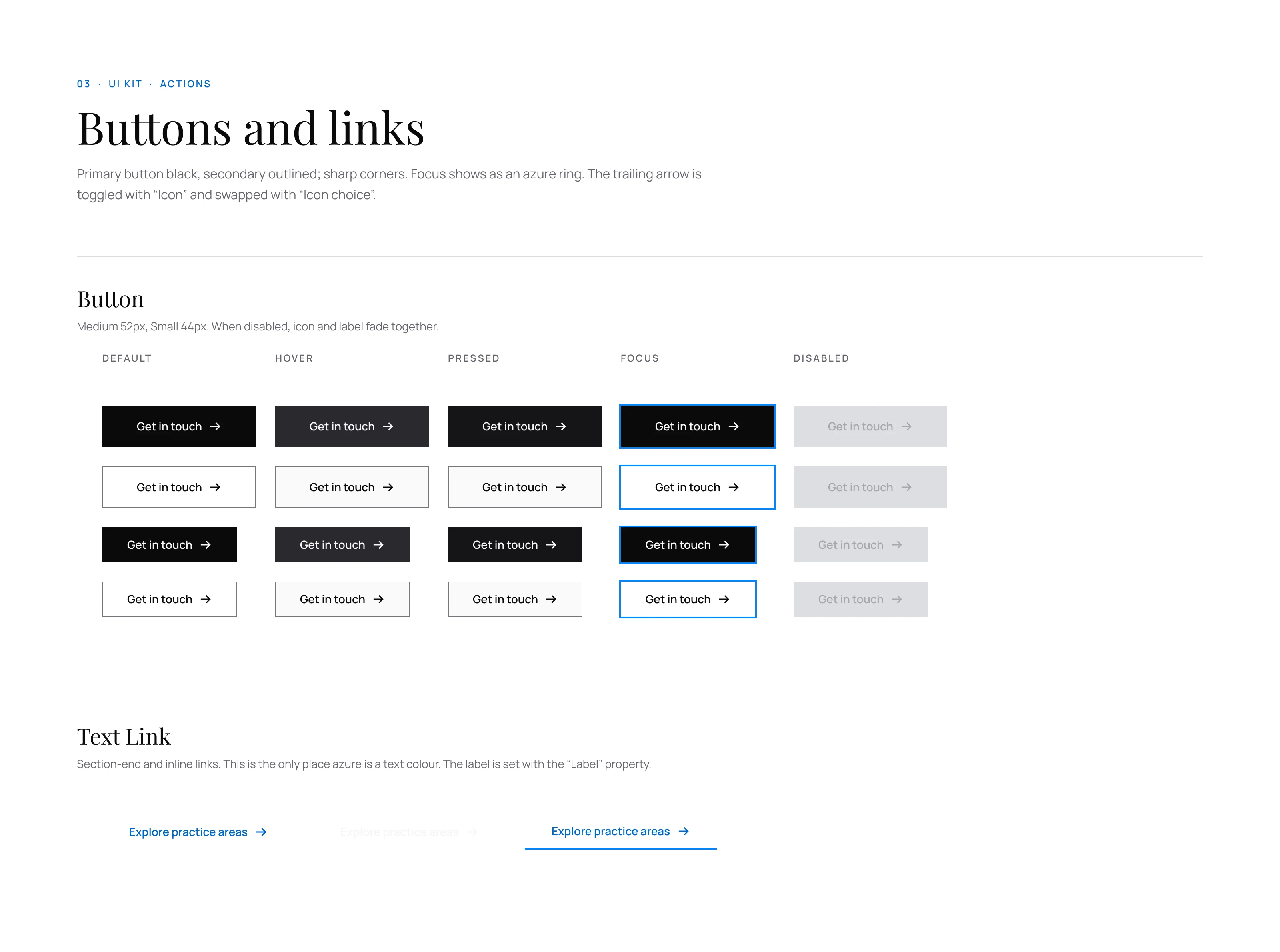
Turned the brand into a UI kit: colour and type tokens, 32 sharp icons and components from buttons to FAQs.
- 04
Website
Built six page templates from those components and took the site live.
Identity
Sharp, monochrome,measured
A monogram in black and white, Playfair Display for headlines, Manrope for everything that has to be read — and one accent, azure, used sparingly.


- 01
Formal, not distant
Law explained in plain Turkish — short sentences, clear headings, a calm tone.
- 02
Proof, not claims
No “best”, “leading” or “expert”: trust comes from education, experience and a clear process.
- 03
No pressure
No results promised, no success rates, no “call now” — the bar rules became the brand’s voice.
UI kit
from tokensto build
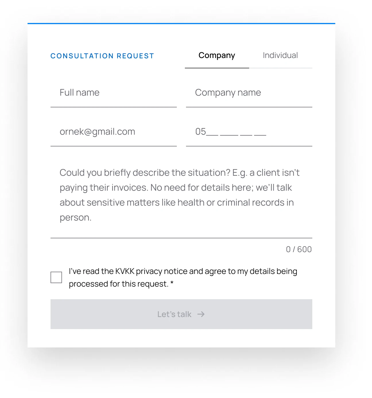
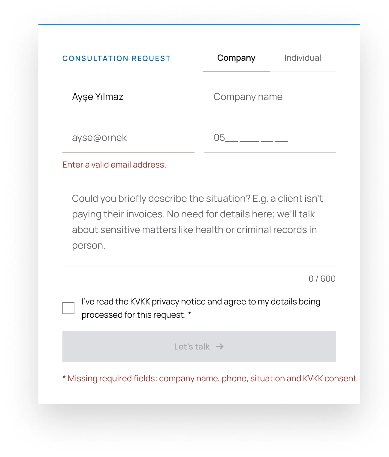
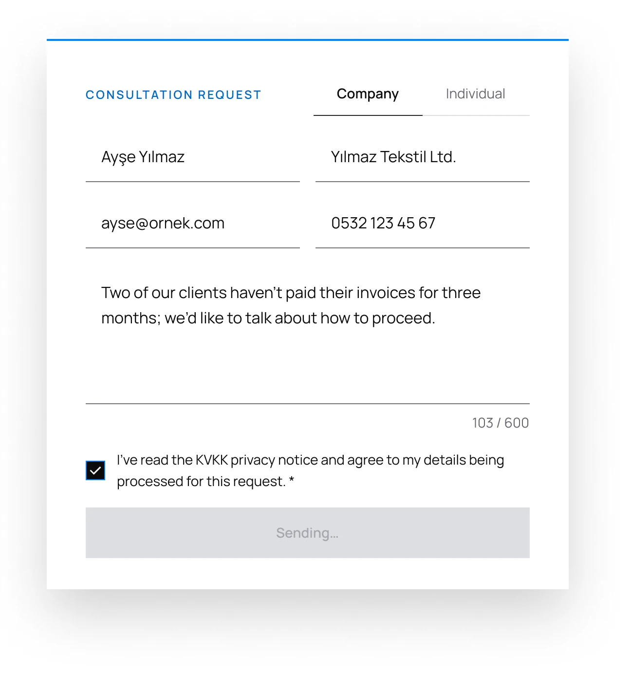
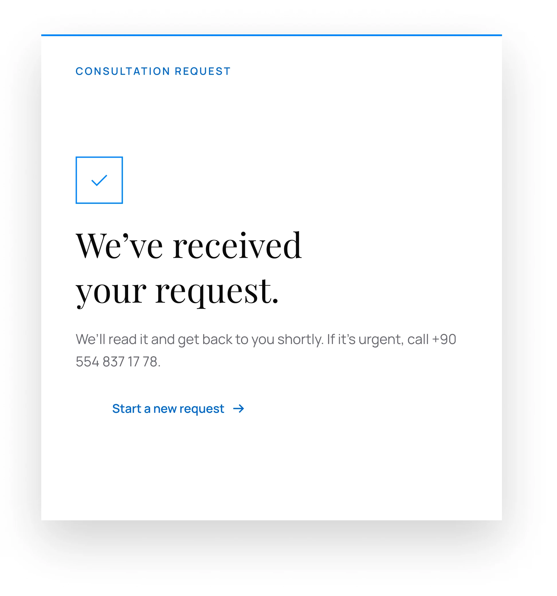
The website is built entirely from this kit: colour and type tokens, 32 sharp icons and components from buttons to the consultation form — each with every state it needs.
- 01
Tokens, not hex
Every colour, space and text style is a variable — change the token, not the layer.
- 02
Errors in words
Form errors are explained in text, never by colour alone; labels are always visible.
- 03
Fair by default
Under KVKK, rejecting cookies is as easy as accepting; nothing is pre-ticked.
Website
Six pages,one voice
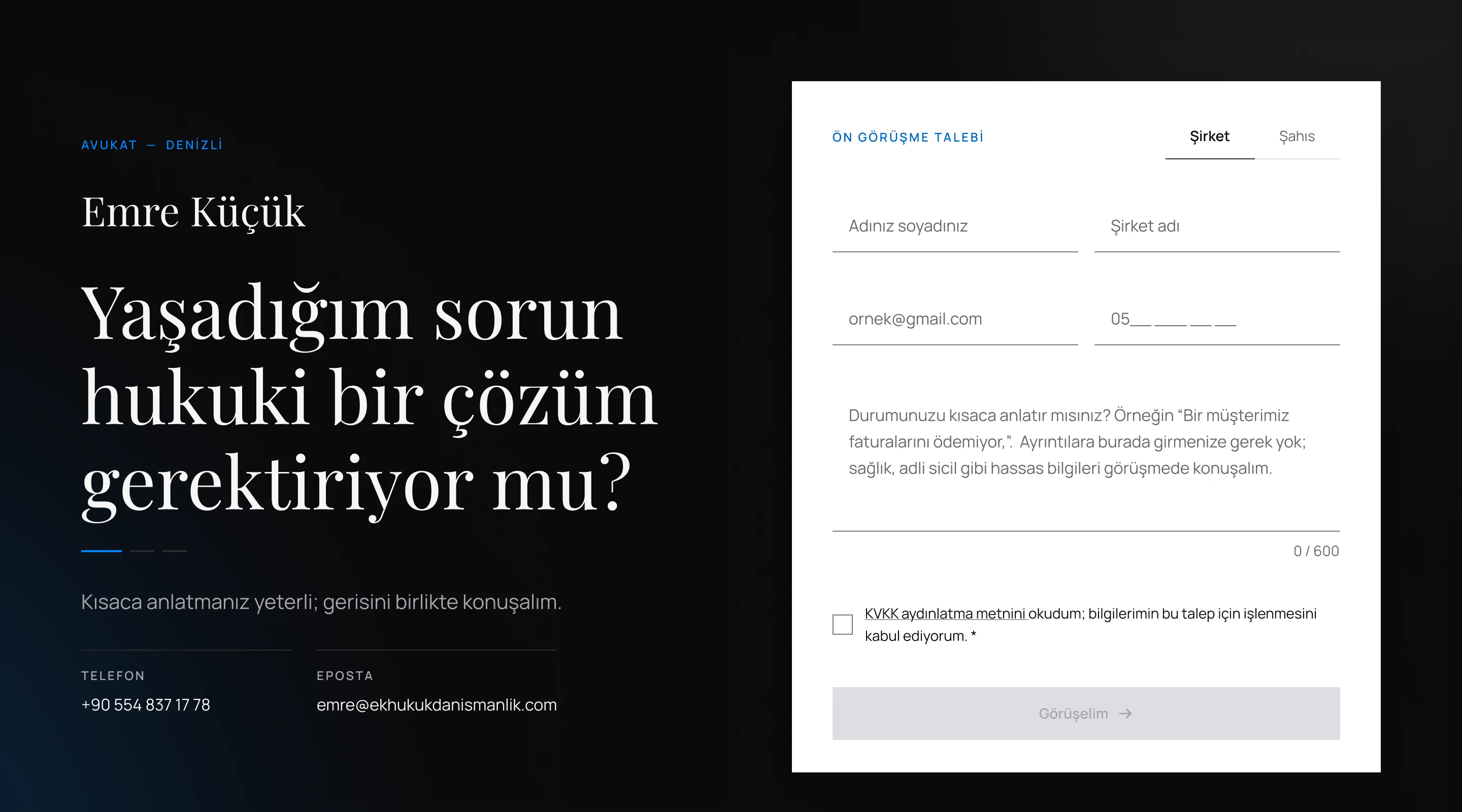
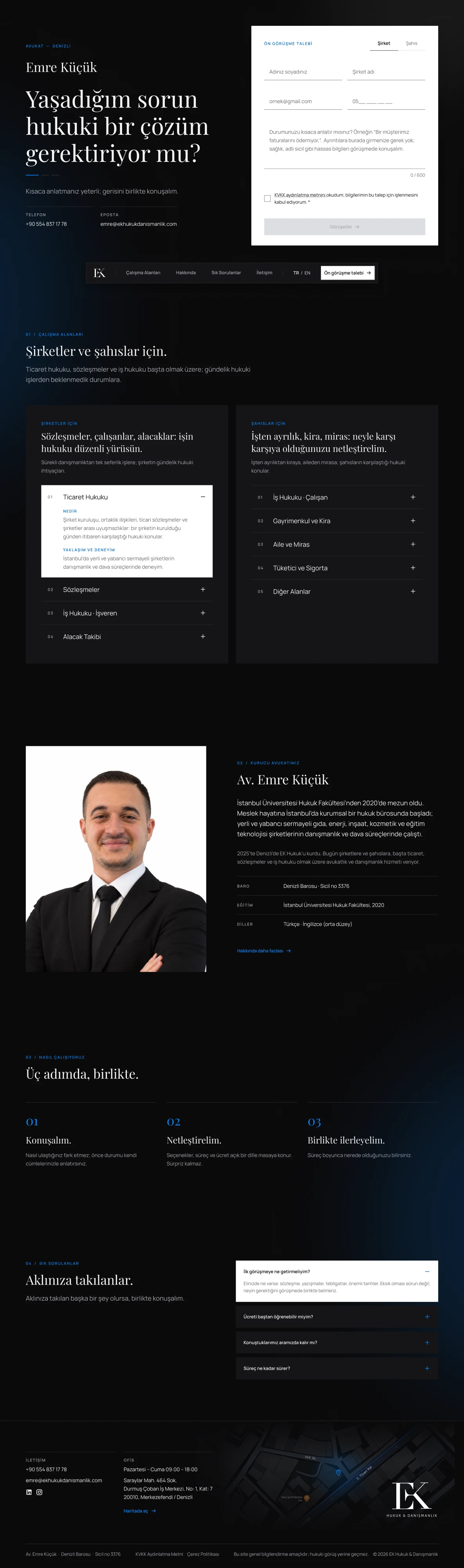
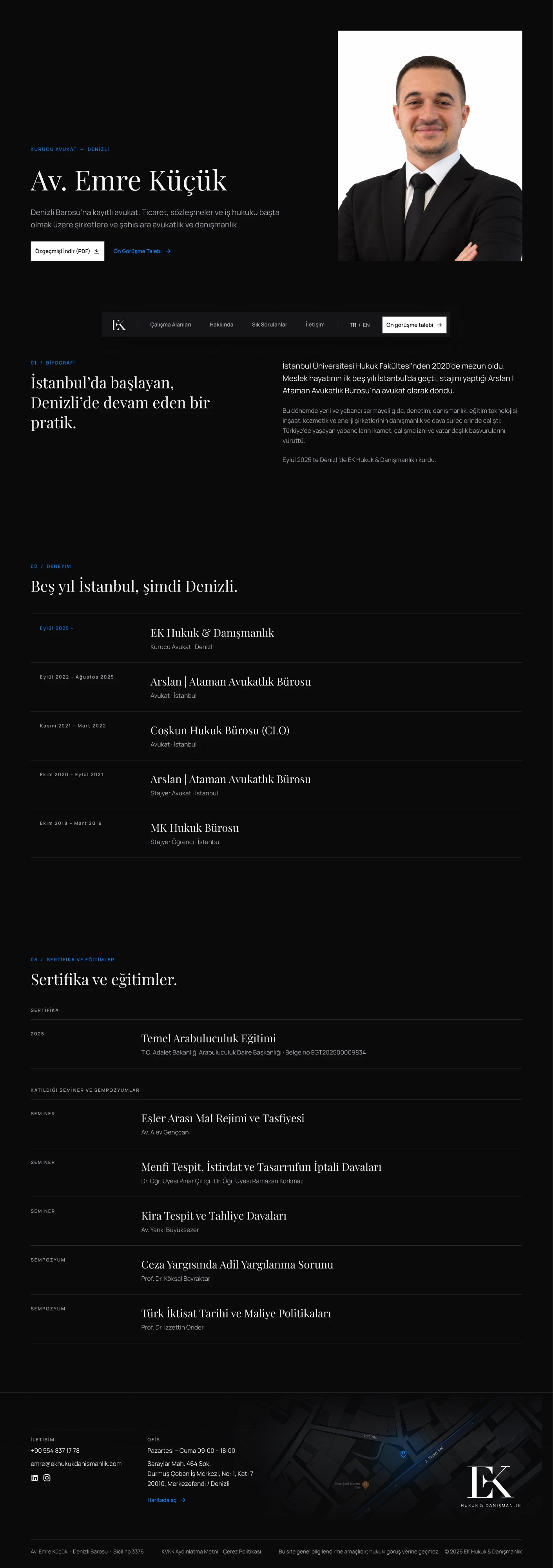
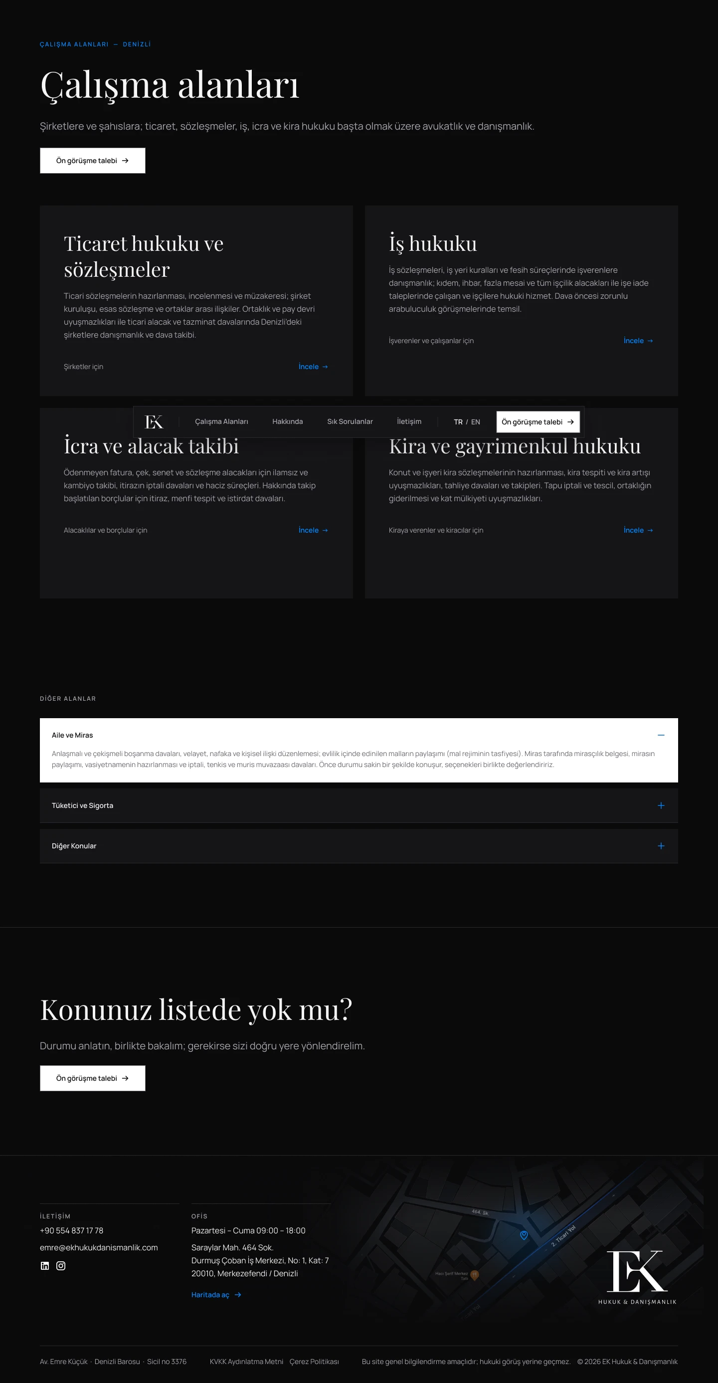
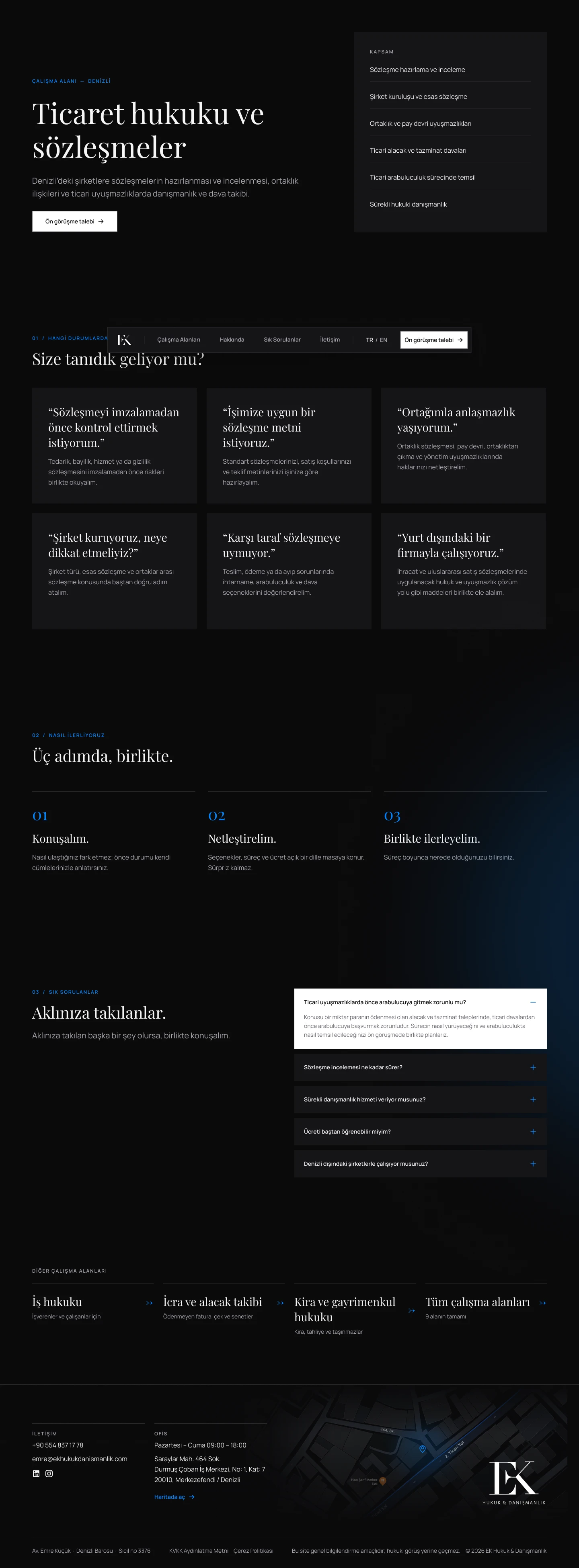
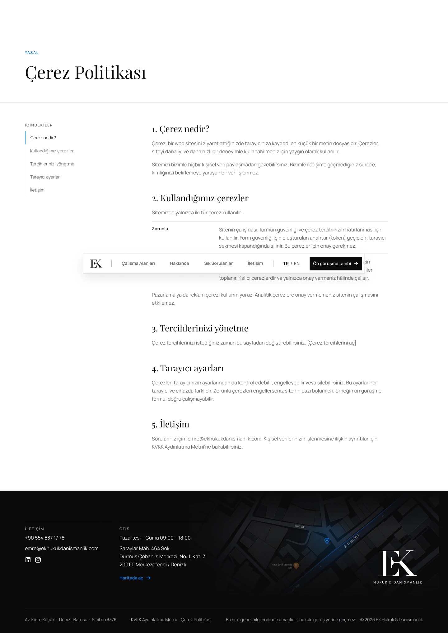
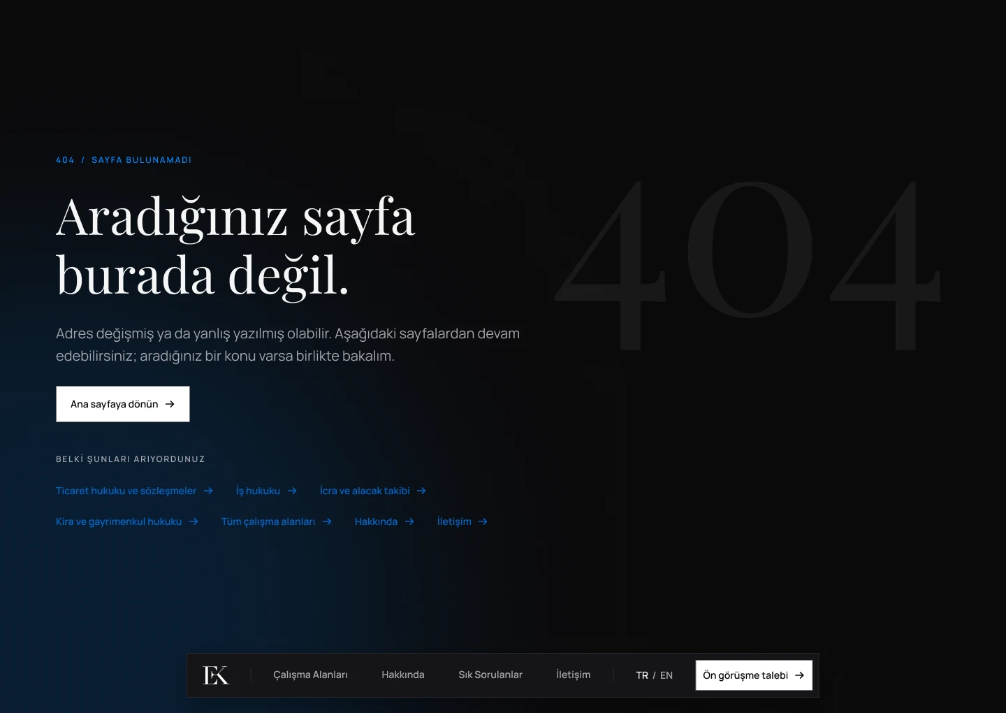
Built from the kit and written in the brand’s voice: a home page that opens with the consultation form, practice areas with their own FAQs, and legal pages made to be read. Shown here as it is live, in Turkish.
- 01
Form first
The home page opens with the consultation form — the one action the site exists for, with no pressure in the copy.
- 02
An FAQ for every area
Each practice-area page ends with three or four questions people actually ask, in plain Turkish.
- 03
Legal pages, readable
Cookie and privacy pages get a table of contents that follows you as you scroll.
Outcome
WhatI learned
- 01
Constraints make a voice
The bar rules ruled out the usual marketing language. Designing around them gave the brand its calm, factual tone.
- 02
Build the kit first
Tokens and components came before pages — so six pages stayed consistent, from the hero form to the 404.
- 03
Trust lives in details
Readable legal pages, a fair cookie banner and errors explained in words do as much for trust as the logo.